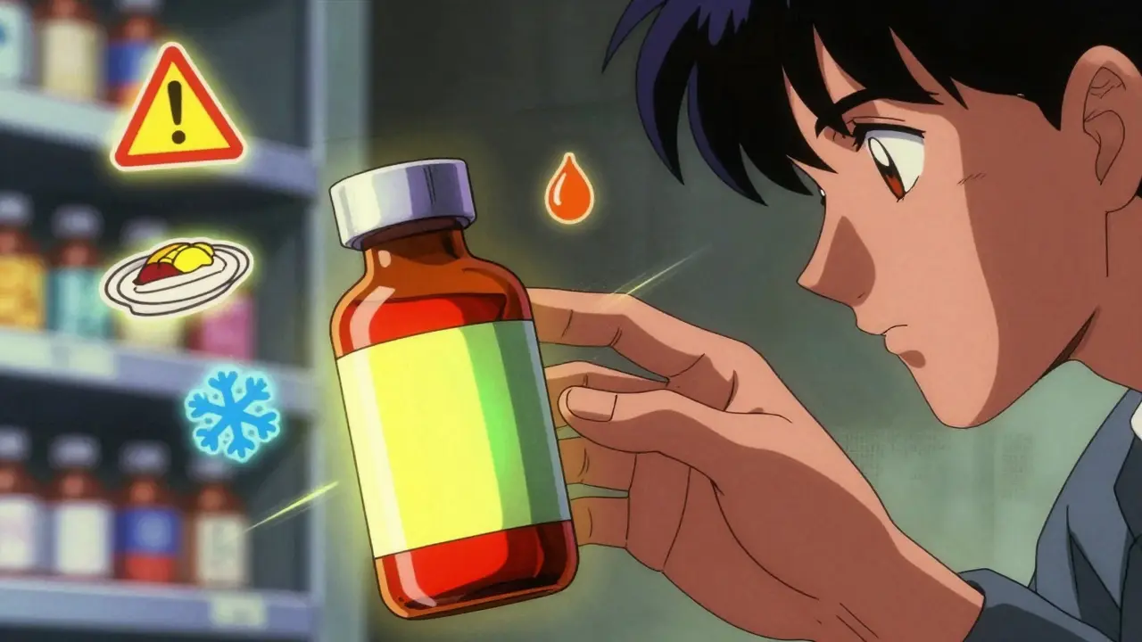
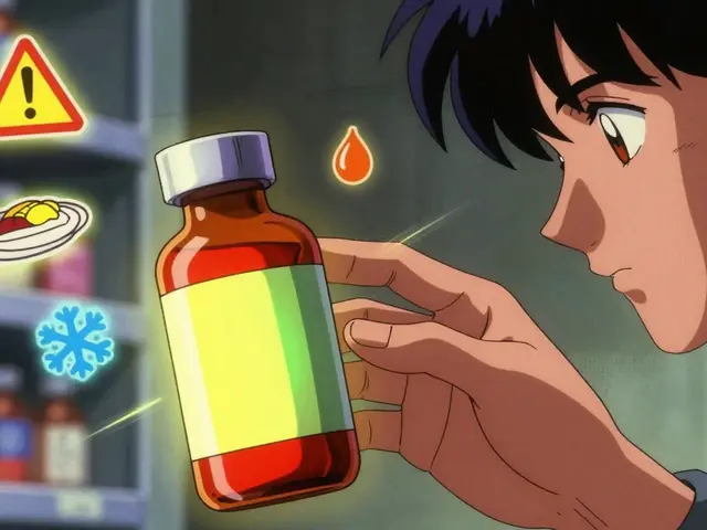
Ever opened your medicine bottle and seen a bright red, yellow, or green sticker stuck on the side? You might have ignored it, thinking it’s just extra paperwork. But those little color stickers? They’re not random. They’re lifesavers.
Why These Stickers Exist
Every year, over 1.3 million medication errors happen in the U.S. Many of them aren’t because doctors made a mistake-they’re because patients didn’t understand how to take the medicine. That’s where auxiliary labels come in. These aren’t the main prescription label with your name and dosage. These are the small, colorful stickers added by the pharmacist to give you extra, critical info that doesn’t fit on the main label.
Think of them as your personal medication assistant. They remind you not to drink alcohol with your pills, tell you to take the medicine with food, or warn you that it needs to stay cold. They’re especially important because studies show half of all patients forget verbal instructions within 48 hours of leaving the pharmacy.
What the Colors Mean (And Why It Matters)
There’s no federal law that says what color means what-but pharmacies across the country use the same system because it just works. Here’s the real breakdown:
- Red = Danger. This is for serious risks: "May Be Habit-Forming," "Do Not Take with Alcohol," or "May Cause Drowsiness." About 37% of all auxiliary labels are red. If you see red, stop and read it carefully.
- Yellow = Caution. These are warnings that matter but aren’t life-threatening: "May Cause Upset Stomach," "Avoid Sun Exposure," or "Take on an Empty Stomach." About 28% of labels are yellow.
- Green = Instructions. This is your "how to take it" guide: "Take with Food," "Take Once Daily," or "Shake Well." Green makes up 22% of labels and helps you follow the right routine.
- Blue = Storage. This tells you where to keep the medicine: "Keep Refrigerated," "Store at Room Temperature," or "Protect from Moisture." Used on 13% of labels, especially for insulin, biologics, or liquid antibiotics.
Why does color matter? A 2020 study by the American Society of Health-System Pharmacists found that 87% of people instantly associate red with danger. Yellow triggers caution. Green feels calm and instructional. It’s not just about looks-it’s about quick, instinctive understanding.
Where the Stickers Go Makes a Big Difference
Most pharmacies stick these labels vertically on the side of the bottle. That’s easy for them-but it’s easy to miss. A 2019 study from the University of California found that when labels are placed horizontally across the front of the bottle, patients are 31% more likely to notice them.
Even better? Interactive placement. Some pharmacies now use labels that only appear when you twist off the cap. That forces you to look at it. Research shows this method increases noticeability by 63% compared to just sticking it on the side.
Here’s the problem: 82% of prescriptions still use vertical placement. That means most people are missing critical info simply because the label isn’t in their line of sight.
Common Labels You’ll See (And What They Really Mean)
Not all labels are created equal. Here are the most common ones-and the hidden truths behind them:
- "Take with Food" - This isn’t just "eat something." It’s meant to reduce stomach upset. But a 2021 Johns Hopkins study found 22% of patients thought it meant "take right after a big meal," which can actually reduce how well the drug works.
- "Take Until Finished" - Especially common with antibiotics. This label helps prevent antibiotic resistance. A 2022 JAMA study showed prescriptions with this label had 18.7% higher adherence rates.
- "Keep Refrigerated" - Critical for insulin, some liquid antibiotics, and biologics. If you leave these out, they can lose effectiveness. One study found 18% of these meds require cold storage.
- "May Cause Drowsiness" - Often paired with opioids, sleep aids, or antihistamines. Don’t drive or operate machinery. This label prevents thousands of accidents each year.
And here’s something surprising: 41% of NSAID prescriptions (like ibuprofen) come with a "Take with Food" label. But only 27% of antibiotic prescriptions have a "Do Not Take with Alcohol" label-even though mixing alcohol with antibiotics can cause serious reactions.
Why Some Labels Are Missing (And Why That’s Dangerous)
Despite how useful they are, a 2016 University of Illinois study found that 15-25% of prescriptions at retail pharmacies had no auxiliary labels-even when clinical guidelines said they should.
Why? Time. Pharmacists are rushed. Or they assume the patient already knows. Or they’re not sure which label to pick.
And sometimes, labels contradict each other. One sticker says "Take on Empty Stomach," another says "Take with Food." That confusion leads to errors. The Institute for Safe Medication Practices recommends no more than 1-3 labels per bottle. More than that? You get label clutter-and patients tune out.
What Happens When Labels Work
The numbers speak for themselves:
- Prescriptions with proper auxiliary labels lead to 18.7% better adherence for chronic meds.
- That translates to $1,200 in annual healthcare savings per patient.
- Proper labeling prevents about 127,000 emergency room visits each year-saving $1.37 billion.
Pharmacists agree: 78% say these labels are essential. And 63% say their error rates dropped after standardizing them.
The Big Gaps: Language and Literacy
Here’s a problem most people don’t talk about: 25.1% of U.S. households speak a language other than English at home. But only 22% of pharmacies offer auxiliary labels in languages other than English.
And for people with low literacy? Text-only labels aren’t enough. A 2018 study found that adding simple pictograms-like a glass of water for "Take with Food" or a snowflake for "Refrigerate"-boosted understanding by 47%.
Patients want this. A 2022 University of Michigan survey showed 83% prefer labels with both text and pictures. Yet most pharmacies still use plain text.
What’s Changing in 2026
Technology is starting to catch up. In 17% of chain pharmacies, you can now scan a QR code on the label to watch a 30-second video explaining how to take your medicine. Some hospitals are testing smart labels with ink that changes color if the medicine gets too warm-critical for insulin and vaccines.
California’s AB-1352, effective January 1, 2024, now requires specific warning labels for high-risk drugs like opioids and benzodiazepines. The FDA also released new draft guidance in September 2023 pushing for stronger opioid warning labels.
But here’s the catch: Only 38% of pharmacies have adopted national standardization guidelines because it costs $2,400 per location to update systems. That’s why you still see inconsistencies.
What You Should Do
Don’t ignore those stickers. Read them every time-even if you’ve taken the medicine before. Doses change. Side effects change. New warnings get added.
Ask your pharmacist: "Is there anything I should know about this medicine that’s not on the main label?" They’re trained to explain them.
If you don’t understand a label, ask for a picture version. If you speak another language, ask if they have the label in your language. Most pharmacies can print them on request.
And if you see too many labels, or conflicting ones-speak up. Clutter is dangerous.
These stickers are the last line of defense between you and a medication error. They’re not bureaucracy. They’re protection.


Comments
Jenci Spradlin
January 9, 2026red sticker = dont drink. yellow = might give you a tummy ache. green = take with food. blue = keep cold. why do they make it so complicated? i just wanna know if i can have a beer with my pills.
Darren McGuff
January 11, 2026Finally someone explains this properly. I work in a pharmacy in London and I can’t tell you how many times people ignore the red labels. One guy took his opioid with whiskey because he ‘didn’t read the sticker.’ Ended up in A&E. These aren’t suggestions-they’re survival guides. Color coding saves lives, even if it’s not federally mandated. The system works because it’s intuitive, not because it’s bureaucratic.
Meghan Hammack
January 12, 2026My grandma couldn’t read the labels until we started using picture ones. She thought ‘take with food’ meant eat a whole sandwich. Now we print the little icons next to the text-glass of water, fridge, sun with a line through it. She hasn’t missed a dose in two years. Simple visuals = huge difference. Why don’t more places do this?
RAJAT KD
January 14, 2026Indian pharmacies don’t even use these stickers. We get one tiny paper slip with tiny font. People die because they don’t know not to mix antibiotics with alcohol. This system should be global.
Catherine Scutt
January 15, 2026Of course the red ones are ignored. People think they’re just marketing. Like those ‘may cause drowsiness’ labels on Benadryl-like I’m gonna read that when I’m already half-asleep. If you’re dumb enough to mix meds and booze, you deserve what you get.
Micheal Murdoch
January 16, 2026It’s funny how we treat medicine like a magic spell. You take the pill, the problem vanishes. But the real work is in the details-when, how, what to avoid. Those stickers are the quiet teachers we refuse to listen to. We want instant results but won’t bother with the instructions. We’re not lazy-we’re just disconnected from the process.
Drew Pearlman
January 18, 2026I’ve been on 12 different meds in the last 5 years and I read every single label. Every. Single. One. Even if I’ve taken it before. Because I learned the hard way-my last doctor changed my dose, didn’t tell me, and the label said ‘take once daily’ instead of ‘twice.’ I nearly passed out at work. Now I treat every sticker like it’s my last warning. Don’t be the person who says ‘I didn’t know.’ You had the info. You just chose to ignore it.
Alicia Hasö
January 18, 2026This is why I became a pharmacist. I’ve seen the chaos when people don’t understand their meds. I spend extra time explaining the stickers-not because I have to, but because I want to. I print picture labels for patients who need them. I don’t care if it takes 5 extra minutes. One less ER visit means one more family dinner. We’re not just dispensing pills-we’re protecting lives. And if your pharmacy doesn’t offer visual aids, ask for them. Demand them. It’s your right.
Aron Veldhuizen
January 20, 2026Color coding is a cognitive shortcut designed to exploit psychological priming. Red triggers amygdala activation, yellow activates the anterior cingulate cortex, green induces parasympathetic relaxation. This is behavioral engineering disguised as pharmacy practice. The real issue isn’t the labels-it’s that we’ve outsourced our responsibility to a system that relies on conditioned reflexes rather than informed consent. You’re not reading a label-you’re responding to a stimulus. Wake up.
Chris Kauwe
January 21, 2026Let’s be clear: the FDA’s draft guidance is a step forward, but it’s still reactive. We need mandatory interoperable digital labeling standards integrated with EHRs. QR codes are a band-aid. We need blockchain-verified, temperature-sensitive, multilingual, AI-augmented smart labels that auto-update based on patient vitals and drug interactions. Anything less is pharmaceutical negligence. And if your pharmacy hasn’t budgeted for the $2,400 upgrade? They’re not just behind-they’re endangering patients.
Matthew Maxwell
January 21, 2026Of course 15-25% of prescriptions have no labels. Because pharmacists are overworked and underpaid, and the system is broken. But that doesn’t excuse the fact that patients are too lazy to ask. If you don’t understand your medication, you have one job: ask the pharmacist. Not Google. Not your cousin who ‘took that once.’ Ask. The person who actually knows. It’s not hard. It’s not complicated. It’s just inconvenient for you.
Pooja Kumari
January 23, 2026I had a friend who died because she didn’t know her insulin had to be refrigerated. She left it in her purse for three days. The pharmacy gave her a blue sticker. She said she thought it was just decoration. I cried for weeks. Now I show everyone my mom’s prescription bottle with the faded blue label. I tell them: ‘This isn’t a sticker. It’s a lifeline.’ If you think it’s paperwork, you’re already one step from the ER.
Elisha Muwanga
January 24, 2026Why do we need a federal law to make people read? We’re a nation of adults. If you can’t read a sticker, maybe you shouldn’t be taking prescription drugs. This isn’t about color-it’s about responsibility. Stop blaming the system. Start taking ownership. Or stop complaining when you end up in the hospital.
Write a comment